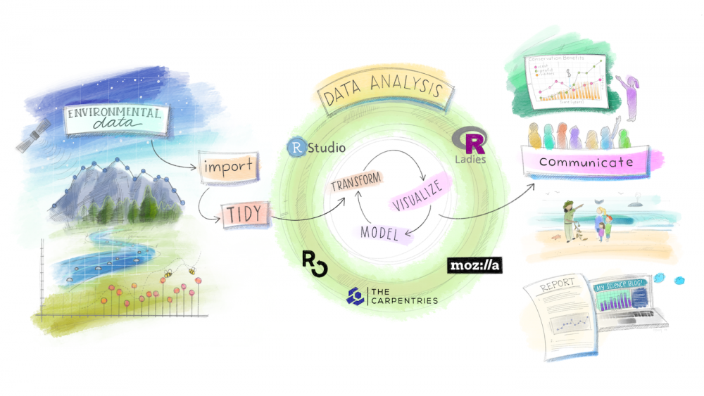
Data journalism is increasingly used to help the public understand complex scientific and social issues, but what makes an effective data visualization? What techniques should we employ to create compelling graphs and tell better stories? Using environmental data, we examine a set of real-world figures and graphs to identify techniques commonly used in data journalism and explore how to thoughtfully incorporate them into our work. Then we learnt to recreate them responsibly and reproducibly using the R Programming language.
While this themed session focuses on environmental data, the concepts here are transferrable and applicable to a wide range of subjects where data plays an important role in understanding research outcomes, information diffusion, media literacy, etc.
The participants were given the space to brainstorm and discuss visualizations amongst themselves. The discussion points for each of the visualizations demonstrated were:
- How does the visualization perform?
- What do you notice?
- What do you wonder?
- What’s going on in this graph? What story can it tell?
- What could be improved upon? If anything?
Workshop Materials, including R worksheet, and National Parks Visitation dataset
Environmental Data Literacy Tools:
- New Data Tools and Tips for Investigating Climate Change by Global Investigative Journalism Network
- Environmental Resources by the Society of Professional Journalists
- Toolbox for Teaching Climate & Energy
- Data Literacy CEEDAR
- The Data Literacy Project
- Culturally Relevant Education in Environmental Data Science
Readings:
- Bahlai, C et al. (2019). Open science isn’t always open to all scientists. American Scientist 107 (2): 786
- Ch 14 in Indigenous Data Sovereignty, Building a data revolution in Indian Country by Dr. Desi Rodriguez-Lonebear
- Cheruvelil, KS and PA Soranno (2018). Data-intensive ecological research is catalyzed by open science and team science. BioScience 68 (10): 813 - 822
- Hampton et al. (2015). The Tao of open science for ecology. Ecosphere 6 (7): 1 - 13C
- Lowndes et al. (2017): Our path to better science in less time using open data science tools
- Mah, Alice. (2016) Environmental justice in the age of big data : challenging toxic blind spots of voice, speed, and expertise. Environmental Sociology.doi: 10.1080/23251042.2016.1220849
- Martha C. Monroe, Richard R. Plate, Annie Oxarart, Alison Bowers & Willandia A. Chaves (2019) Identifying effective climate change education strategies: a systematic review of the research, Environmental Education Research, 25:6, 791-812, DOI: 10.1080/13504622.2017.1360842
- Nyman, M., Ellwein, A. L., Daniel, M., and Connealy, S., Using Data-Rich Instruction for Climate Change Education: Road Blocks and Pathways, vol. 2011, 2011.
- The Next Generation of Environmental Scientists are Data Scientists by Jenny Seifert and Kathryn Meyer
- Wilke, C. (2019). Fundamentals of data visualization: A primer on making informative and compelling figures.
- Wilson et al. (2017): Good enough practices in scientific computing
Examples of Data Visualization Literacy:
- Gonchar, M. (2019, February 28). Teach about climate change with these 24 New York Times graphs. The New York Times. Retrieved April 8, 2022, from https://www.nytimes.com/2019/02/28/learning/teach-about-climate-change-with-these-24-new-york-times-graphs.html
- Climate Analytics
People:
- Environmental data science study group at UCSB
- #rstats,
- #tidytuesday
- @allison_horst
- @dataandme
- @drob
- @hadleywickham
- @WeAreRLadies
- @jennybryan
- @ROpenSci
- @juliasilge
- @apreshill
- R-Ladies
- R-Users groups
- R-Philly
- Helen Fillmore
- Charitie Ropati
- Sumak Helena
- Dallas Goldtooth
- Winona Laduke
- Lydia Jennings
- Nina Rose Berglund
- Tara Houska
- Xiuhtezcatl Martinez
- Quannah Chasinghorse
- Mine Cetinkaya-Rundel
- Tiffany Timbers
- Julia Lowndes
- Jenny Bryan
- Alison Hill
- Greg Wilson
- Kelly Bodwin