Week 4 of the Data Jam focused on creating interactive web visualizations. Data visualizations help us identify trends and communicate information about large datasets. Good visualizations can introduce a dataset and the information it contains; summarize key messages; or highlight information in a readable format. Especially in interactive web visualizations, a user’s ability to select specific data points or change elements of the visualization can help shape the story of a visualization.
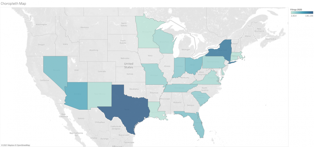
In this workshop, we used Tableau Public, a free and easy-to-use data visualization tool, to visualize data from the Eviction Tracking data from the Eviction Data Lab. The Lab tracks weekly eviction filings since March 2020 to monitor the impact of the COVID-19 pandemic and associated policies. The data is available at https://evictionlab.org/eviction-tracking/get-the-data/. We worked with one of the Lab's public datasets: the All Cities dataset, which includes the 31 cities the Lab is tracking. Before diving in with the dataset, we assessed some of the proportional symbol maps the Eviction Lab built to communicate information with policymakers, journalists, and the general public.
Watch the recording and read through the workshop notes to learn more.
Building Visualizations
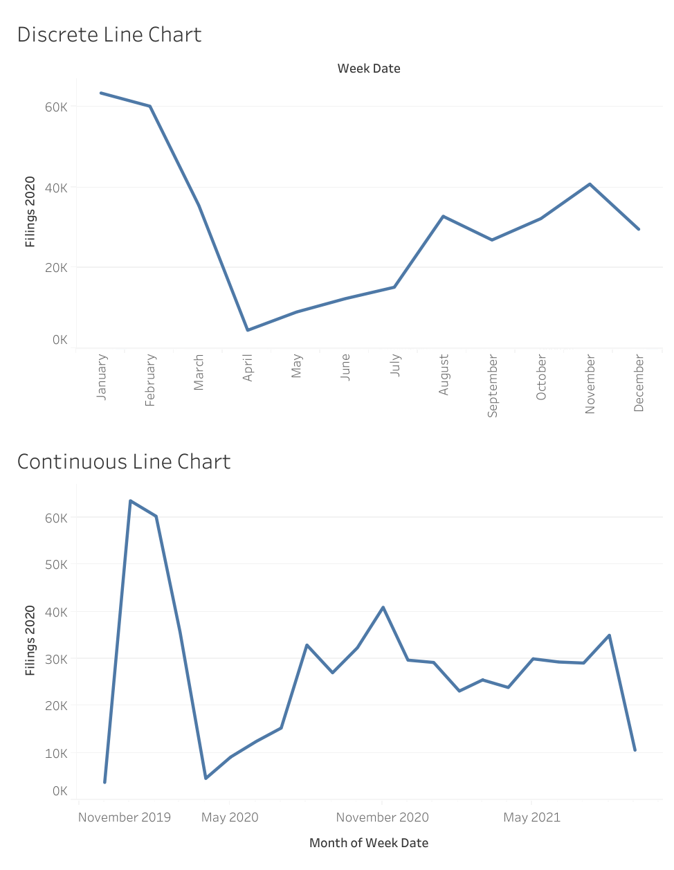
As we explored the dashboard of Tableau Public and built various visualizations using the dataset, we thought about choosing the right format for our research questions. Visualizations come in many different formats, which have various strengths and limitations. For example, we compared discrete line charts versus continuous line charts to show how the sum of eviction filings each week changed over time. The discrete line charts aggregate data by month and then plot a value for months in 2020 and 2021, while the continuous line chart shows each month during that period as a distinct point on the map.
In addition to the visualizations shown in this blog post, you can see the completed workbook on Tableau Public at public.tableau.com/app/profile/emily.esten/viz/EvictionLabData/Dashboard.
Getting Started & Credits
Tableau Public can be downloaded here for personal or professional use at public.tableau.com/en-us/s/download. Tableau offers free one-year Tableau Desktop licenses to students –sign up at tableau.com/academic/students. Tableau Desktop offers all the full features of the software, including allowing you to save and share workbooks locally, which may be important if you are working with sensitive data. Tableau offers Starter Kits, which include videos and step-by-step instructions for authoring, interacting, publishing, and administering Tableau.
This workshop uses data from the Eviction Lab’s Eviction Tracking System. The proper citation is as follows: Peter Hepburn, Renee Louis, and Matthew Desmond. Eviction Tracking System: Version 1.0. Princeton: Princeton University, 2020. www.evictionlab.org.